Custom class field
Overview
The College Drupal distribution supports placing additional classes on most content rows using the “Custom Class” field. This class is applied to the wrapper of the content row. You can add multiple classes by separating them with a space. For example: topo-white jumbo narrow.
The College Drupal distribution default classes
There are a number of built in classes to further style a content row. This list will grow in the future.
| Class name | Description |
|---|---|
| narrow | Reduces the max width of the content. Useful when a paragraph would span the full page width to improve readability. |
| jumbo | Make all the headings and text larger. |
| height-100vh | Makes the height 100% of the current viewport (browser window) |
| vertical-center | Center the content vertically in the container. Works well to put text in the center of an image overlay or in a two column setup. |
| heading-left | Left align the heading field (default is center) |
| heading-right | Right align the heading field (default is center) |
| hide-heading | Hide the heading field, useful if using tabs/accordions to prevent the heading from appearing twice, once in the tab item and once in the content. |
| hide | Hide the whole section from the published page. |
| no-gutters | Remove the space between columns in a Column row |
| edge-to-edge | Eliminate margins and make element full width |
| img-to-edge | Make the first image in the content ignore margins and expand to full width. |
| unwrap-table | table content will not overflow outside the parent container |
| vert-text | Centers text vertically and eliminates card background and border |
There are a number of built in classes to add backgrounds to a content row.
| Class name | Description |
|---|---|
| starburst | Adds an ASU starburst effect to the background. Works with background styles: blue, dark grey, gold, grey, maroon and white. |
| stripes | Adds a subtle grey/white striped effect to the background. Changing background style does not change stripe color. |
| morse-black | "Learn to thrive" morse code with a primary background color of black. Requires background style: black to apply. |
| morse-white | "Learn to thrive" morse code with a primary background color of white. Requires background style: white to apply. |
| network-black | Neuron style network with a primary background color of black. Requires background style: black to apply. |
| network-white | Neuron style network with a primary background color of white. Requires background style: white to apply. |
| topo-black | Topographic map of "A" mountain with a primary background color of black. Requires background style: black to apply. |
| topo-white | Topographic map of "A" mountain with a primary background color of white. Requires background style: white to apply. |
There are a number of built in classes to convert a Card into a pre-styled content section.
| Class name | Required row type | Description |
|---|---|---|
| overlapped | Card | Card with the image in the background instead of on top. |
| overlapped-left | Card | Moves the card image into a right side column with the card body slightly overlapping it. |
| overlapped-right | Card | Moves the card image into a left side column with the card body slightly overlapping it. |
| inset-box | Card | Creates a gray background around the card and centers it on the page. |
| side-left | Card | Card with image on the left side instead of on top. |
| side-right | Card | Card with image on the right side instead of on top. |
There are a number of built in classes to provide alternate brand compliant styling.
| Class name | Required row type | Description |
|---|---|---|
| hero-btn1-gold | Hero | Gold background color for button 1 only |
| hero-btn2-gold | Hero | Gold background color for button 2 only |
| hero-btn12-gold | Hero | Both buttons gold background color |
Animation classes
Animation classes from the Animate.css library can be used in the Custom Class field. The field should also contain the “animated” class. The usage of the "animate__" prefix is not necessary within the context of our distribution.
By default, the animation will play on page load, so items below the fold will play before you see them. You can prefix the animate.css class with “scroll-” to prevent the animation from playing until the user scrolls into view. This feature is not a part of the animate.css library so they don’t mention it in their documentation.
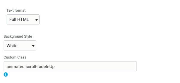
An example of a content row where the content fades in from below when the user scrolls into view, add to the Custom Class field:
animated scroll-fadeInUp
| Class name | Description |
|---|---|
| animated | required class to trigger animation library |
| scroll- | prefix to prevent animation until element is in the user's view |
Attention seekers |
Back entrances, exits | Bouncing entrances, exits | Fading entrances | Flippers, lightspeed | Rotating entrances, exits | Fading exits | Sliding entrances, exits | Zooming entrances, exits | Specials |
|---|---|---|---|---|---|---|---|---|---|
| bounce | backInDown | bounceIn | fadeIn | flip | rotateIn | fadeOut | slideInDown | zoomIn | hinge |
| rubberBand | backInLeft | bounceInDown | fadeInDown | flipInX | rotateInDownLeft | fadeOutDown | slideInLeft | zoomInDown | jackInTheBox |
| headShake | backInRight | bounceInLeft | fadeInDownBig | flipInY | rotateInDownRight | fadeOutDownBig | slideInRight | zoomInLeft | rollIn |
| wobble | backInUp | bounceInRight | fadeInLeft | flipOutX | rotateInUpLeft | fadeOutLeft | slideInUp | zoomInRight | rollOut |
| flash | backOutDown | bounceInUp | fadeInLeftBig | flipOutY | rotateInUpRight | fadeOutLeftBig | slideOutDown | zoomInUp | |
| pulse | backOutLeft | bounceOut | fadeInRight | lightSpeedInRight | rotateOut | fadeOutRight | slideOutLeft | zoomOut | |
| shakeX | backOutRight | bounceOutDown | fadeInRightBig | lightSpeedInLeft | rotateOutDownLeft | fadeOutRightBig | slideOutRight | zoomOutDown | |
| shakeY | backOutUp | bounceOutLeft | fadeInUp | lightSpeedOutRight | rotateOutDownRight | fadeOutUp | slideOutUp | zoomOutLeft | |
| swing | bounceOutRight | fadeInUpBig | lightSpeedOutLeft | rotateOutUpLeft | fadeOutUpBig | zoomOutRight | |||
| tada | bounceOutUp | fadeInTopLeft | rotateOutUpRight | fadeOutTopLeft | zoomOutUp | ||||
| wobble | fadeInTopRight | fadeOutTopRight | |||||||
| jello | fadeInBottomLeft | fadeOutBottomLeft | |||||||
| heartBeat | fadeInBottomRight | fadeOutBottomRight |
Create your own custom classes
In addition to the animation and default classes, you can write your own classes to use in the Custom Class field using the Drupal Asset Injector module included with The College Drupal distribution. Go to /admin/config/development/asset-injector/css to create a new stylesheet for your site. You can specify which pages it applies to or make it global.
Any custom changes you make need to conform to ASU brand and web standards.